Monday, 28 December 2009

Olympics animation - All Together Now

IOC ¦ All together now from fxandmat on Vimeo.

Here's another amazing animation I found. I wouldn't be surprised if we saw this on the tv soon. I think this wonderfully depicts the need for the countries of the world to come together and take part in this extremely exciting event. It encourages equality and brings all the nations into one big happy family, using the symbolism of physically pulling the lands together with the aid of rope. I love the style of animation in this clip. It successfully uses 3D animation and is brought to life with vibrant warm colours.

Here's the making of the clip below

IOC ¦ All together now making of from fxandmat on Vimeo.

Sunday, 27 December 2009

Random Vimeo Vids


Galileo from Ghislain Avrillon on Vimeo.

Since I don't have a Vimeo account right now, I figured I'd use my blog to post animations from Vimeo on to here. I will eventually get an account, but this will do fine for now.

I really like the textures and sounds in this clip. The ending where they both fly hand in hand with the butterflies is very heart warming aswell. I couldnt help but think that maybe their character designs could have been developed a bit more, because they didnt look very unique.

Low Oxygen from Dylan Forman on Vimeo.

This is a fanatastic vid I saw not long ago. It is extremely simple. It relies on beeping, ambient and muffled groans for sound effects. The Characters are simple yet extremely expressive in their actions. The introduction of them is well done aswell. You immediately know how they survive in the environment they are in, and the dilemma they come across. It has bittersweet ending that leaves the watcher feeling sympathetic for the astronauts, and wanting to see more.

Edit:

A Difference In Shadow from Michael Mier on Vimeo.

Oh man Just saw this and simply had to add it to the post it. Woaah. That is a fantastic clip. It's amazing how a film can lead you to believe one thing and then you realise what the true meaning is at the end. Fantastically lit. I like how the match strokes divide up the story, almost like chapters. Wonderful

Wednesday, 23 December 2009

Jared's Project - Gil Elvgren

In Bill Presing's interview, he talked about a guy called Gil Elvgren, and I decided to check out this guy's art pieces.

http://www.gilelvgren.com/GE/

Above is a link to the Gil Elvgren's website, which celebrates his artwork.

Gil Elvgren was born in 1914, and responsible for creating pin-up images of ladies during the 1930s-1970s period, before passing away in 1980. He was an extremely revered glamour illustration artist in America. Many other artists have been inspired by this influential illustrator


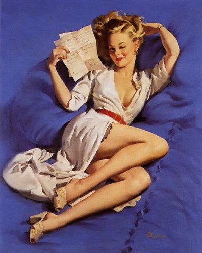
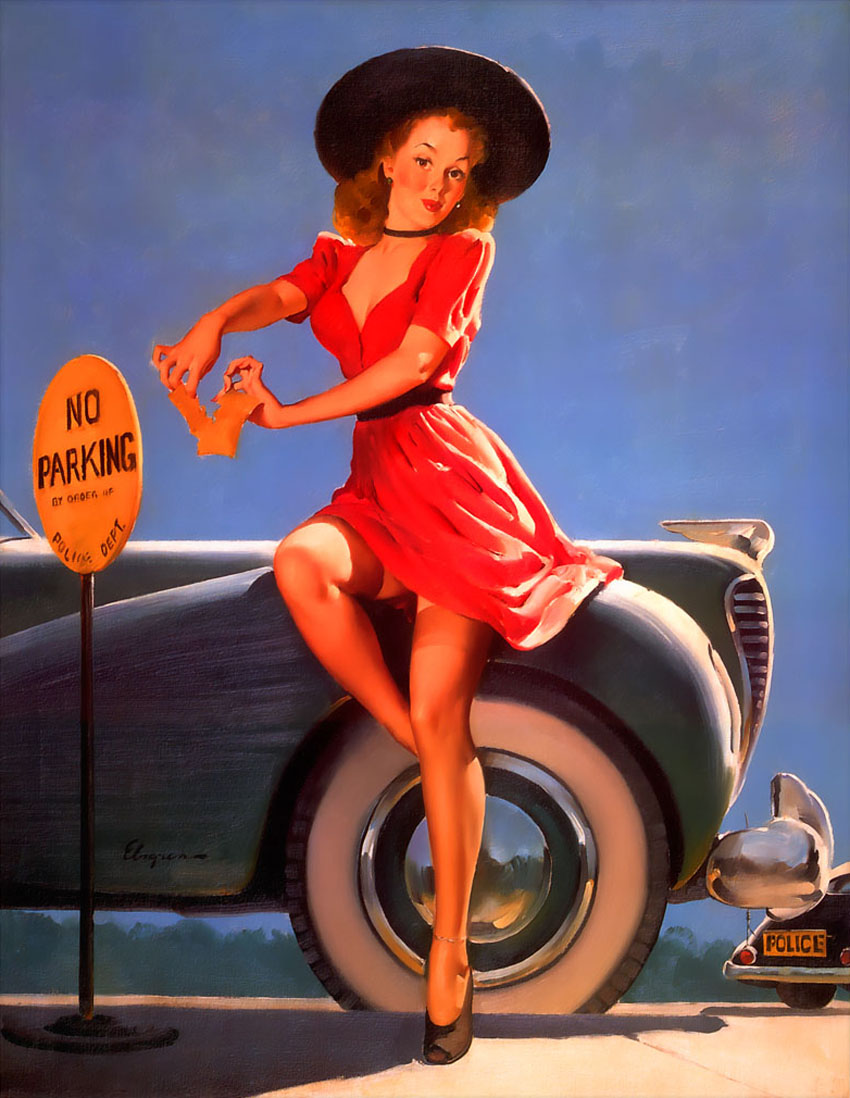
These are examples of some of Gil's work that I admire the most.

At first when I first discovered this guy's work, I felt kinda uncomfortable when looking at it. Being a tomboyish kinda girl myself, I thought that these girls in his pictures seemed very vain and tarty. I kept seeing more and more skantily clothed women in compromising positions, and I wasn't particularly impressed to start with.

However, I now realize what makes his work so successful. These images celebrate the youthful women, and present them in a fun and captivating way. The poses are extremely well drawn and demonstrate some fantastic life drawing skills.

The colours he has chosen have been thought through carefully, and I have noted that he uses complimentary colours in his work. For instance, the picture above has an orange belt right at its centre, and the figure is surrounded by blue fabric. This helps draw the viewer's eye into the picture.

Gil's compositions also help lead the eye around the paintings. The top picture features a lady whose arms and legs create a triangular shape. All the lines of the body draw the eye up to her pouting, mischievous face. Also, she is wearing bracelets on her wrist that stand out very clearly in the picture. These are very subtle and effective ways of guiding people to focus on the important parts of the picture.

What I love the most about his style of drawing is the way he makes these girls look so real and vibrant, whilst maintaining a retro feel to his pieces. I'm aware that I am not very good at drawing women myself, so I think I should study his work more so I can draw interesting lady characters. I want to be able to present them effectively by manipulating shape, colour and composition, and be able to draw a variety of poses involving challenging perspective whilst maintaining proportions

Tuesday, 22 December 2009

David Nicolas - Partizan Lab

The first person I would like to study for Jared's project is a Mr David Nicolas. Here's a link to his bibliography on the (Numero 6) Partizan Lab's site. (for some reason the video clips don't work on the web page)

http://www.partizanlab.com/partizanlab/musicvideos/?numero_6/biography

He was responsible for making a music video that I used to know as a kid, which was for the song "Superman Lovers - Starlight".


Its about a man who dreams of becoming a singing star on tv, and so enlists the help of a little mouse to try and make his aspirations happen. He takes control of the TV network and puts his song on for all to see. Unfortunately, his song is not a success with the nation, but instead attracts the attention of some aliens with better music taste.

This video hosts some fantastic animation and presents some quirky looking character designs. It is very unique and has an interesting style.

However, this is not the video I want to focus on in this post. The music video I want to analyze is of a song called "It's Not The End Of The World" by Super Furry Animals. I watched this very recently on another artist's Youtube favourites list. It's amazing how you find things randomly like this! Haha!


This animation tells the story of a child growing up and becoming a soldier. We see him get enlisted and meet his superiors and how his superiors act in the conflict. There is some very iconic war related imagery in the clip. Examples include scenes where the soldiers being waved goodbye as their train departs, the man receives the letter in the mailbox asking him to join the army, and the bombs dropping through the hatch at the bottom of the plane. These help the viewer see that it is to do with war. Without showing these parts in the music video, it might not have been as obvious that the film was about conflict.

Occasionally, we see the singer in the form of one of the puppets appear. He is pictured descending what looks like a never-ending spiral staircase whilst singing and playing a guitar. I learnt from Dickens' book "Hard Times" that staircases often suggest how a person is ascending to heaven or descending into Hell. Baring this in mind, I think this shot of the singer may symbolize how the world is slowly tumbling into a hellish chaos.

There are some nice reoccurring themes in the film that contrasts the life of a child with the life of a soldier. We see a young boy playing with a remote controlled tank toy, and then later on we see the soldier's tank trundling along. Again, we see the little boy with a paper airplane, and then moments later we see him taking the role of a pilot in a war aircraft and being parachuted down from the skies. There is also scene where the boy is playing with a toy boat in his bath, and before this we see the navy ship sailing in the ocean.

What I really like about this animation is how it represents war visually. The themes are supported by the way the animators have chosen to animate this. The boy's appearance doesnt change that much in the film, with the exception of uniform and clothing. He retains his big baby head and little body. This exaggerates the fact that he is still very young and yet he is participating in a life threatening and frightening career that requires a lot of bravery and courage.

The concept is set in what appears to be a machine operated puppetry machinism. All the scenes flip in and out of the shot in a rather machanical fashion. All the scenes are contained in one box-like stage, and change very frequently. Shutters are used to narrow the frame and focus in on important parts of the scene. At one point the singer is magnified by a set of lenses. The mechanics remind me of the arcade game scene after the credits of James and the Giant Peach. I tried to find a clip of it on Youtube, but I couldn't find it. Hopefully you know the bit I mean. This style makes the world we live in appear to be manufactured and unnatural.

Everything is pretty much in Sepia, making the scenes seem rusty and colourless. This effectively dates the movie, making it look older. There are a few parts of the video that have colour. The little puppets' eyes glow red. Maybe this is to represent the life that may be snatched away from them because of the war.

Numero 6 achieved the special jury prize at the 2002 Imagina Festival and took silver at the D&AD awards in the same year. I think this is deservedly so, considering that I havent seen an animation like this at all. It represents war in an effective way, and I commend it for that.

Bill Presing from Pixar - Interview

This is the link for an interesting interview with Bill Presing

Seriously I found this really inspiring. I have an interest in trying to get into Storyboarding, and to find this fantastic opportunity to see what a skilled storyboarder from Pixar Studios says about his experience is just amazing for me. this is right up my street.

There are so many things I have discovered about the industry that have opened my eyes. He also gave me a handy tip about how to improve your storyboarding skills, and that is:

Take a movie you really like. Then choose your favourite scene from that film. Then playe that scene, but pause it at every significant key frame. Then draw out what you see

This way, I can identify what makes the scene good, and i can use this knowledge for future projects.

Okay I havent quite finished watching the interview, so I might add to this post if I find anything else worth mentioning about the interview on here.

PLEASE WATCH THIS INTERVIEW!

edit: Okay other tips Bill gave for aspiring storyboarders is that you have to be able to:
  • Stage well
  • Have a sense of acting
  • Emote - draw what the character is thinking
  • Draw a lot - "If you think you draw a lot, you need to draw more. It isn't enough!"
  • Be as clear as possible
Also, here's his blog if you're interested
http://billpresing.blogspot.com/

Animation Research - Christmas Project

Jared Taylor, my Animation tutor, has assigned us this task to do over the Christmas holidays. Here's what he said in an e-mail he sent us a while ago -

You have to first of all expose yourself to something new or unknown,
it can be a recommendation from a friend or a tutor, but it has to be
previously unknown to you.
It can be a film, an artist, a designer, an architect, a musician, a
band, a sculpture, a painting, a play, an album, a book, or a poem,
but NOT A GAME!
Then you are going to research that new thing.
Give us some visuals that relate to it if possible.
Also some written commentary... It doesn't need to be much, 3 short
paragraphs will suffice.

I think this is a great way for me to expand my ways of thinking in terms of storytelling and animating, so I figured I definitely give this a shot. I have discovered many excellent random animations I havent seen before recently, and I figured this would be a great opportunity for me to share them with others and analyze them in depth.

Expect to see a few new posts in the next couple of days.

Friday, 27 November 2009

The End- Analysis Of Work


This is what I have accomplished for the Character Design Project. I didn't manage to finish Minnie's 3D design and animate her, but I managed to do a short 2D animation of what I would have done if I had managed to get to that stage.

It's the last day of the project, and I feel as if I've done okay, despite all the problems that cropped up. I feel as if I've learned a lot, and I have a clear view of where my strengths and weaknesses lie. I would like to analyse my work in this post.

What did I enjoy doing?
I thoroughly enjoyed doing all the sketchwork and early development of Wilhemina Biliams. I have always loved doing traditional drawings, and this was no exception. I also had a lot of fun modeling on Mudbox. That program made modeling high resolution 3D models a lot easier. I would recommend that program to anyone.

What did I dislike doing?
I found the research a little bit tedious, but it was fundamental to the development of my character. It also enabled me to rewatch films and clips and look at them from a different perspective, like "The Sword In The Stone", for instance.
I really didn't enjoy modeling in Maya. I don't really like Maya in general, to be honest. In a way, I am glad I modeled mostly in Mudbox because it saved me a lot of stress and frustration. But in other ways, it made some things harder to accomplish.

What did I struggle with?
Although Mudbox was great at making a decent looking model, I think it caused a lot of the problems that we encountered.
I have struggled with Maya, as always. I guess I'm more of a 2Dimensional person really, but I am annoyed that Maya is getting the better of me.

Have I worked well in a group?
I think me and Tom worked well together, and we were able to help eachother with our work output. He helped me with my modeling and rigging, and I helped him with my storyboarding. We have designed characters that have a similar "style" and I think I can picture them in a film together. Minnie and Wee Eck were made to be a romantic interest, and Me and Tom discussed ways in which we could do this successfully. We have listened to eachother's advice and we have communicated well. I don't think we had any issues of laziness or disagreements of any sort. I think we both pulled our weight and have come up with some good work because of this.

What have I learned during this project?
I have discovered some new programs that I have never used before, such as Puppet Master, Toonboom and Mudbox. I have learned to use them for the benefit of our work. I have also discovered what I really struggle with and what I really suceed with. I don't think my talents lie with modeling, rigging and texturing, but I am glad that I tried to improve in these areas. I think I know more about Maya then I did before the project, so that can only be a good thing. I feel that I am much better at doing quick sketches and drawings, and I should ensure that I use these skills to the max when working in a group in future

What could I have done differently
to improve my work?
If I were to redo this project, I would not experiment as much with new flashy programs. I think I would have tried to stick with Maya and learn to model and rig and texture the hard nitty gritty way. I know I would have absolutely hated doing that, but I think I might have become more confident in Maya if I had emersed myself in it more.
I think I would have given myself a bit more time to do the 3D work aswell. We may have been able to back track and reconstruct Minnie to look and operate better if we had enough time. I was disappointed that I had not been able to animate Minnie at the end, because I was looking forward to doing that.
If I was given the choice again between doing Character Design, Environment Construction, or Animated Idents, I would immediately choose the ident project. I'll leave the Maya experts to do what they do best, and I would try and hone my drawing and animating skills!

Screenshots of Rigging

There's some damn freaky pictures right here.


Well, we managed to rig the old granny using Puppet Master. It's a program that makes rigging a bit simpler to do. You type in the right names for the right parts of the rig, and the program configures it for you. Sometimes it makes a few mistakes, but they can easily be sorted out. Pictured above is the final model with the rigging in place.

The rig came out fine, but it desperately needed weighting...
Check out these pictures. They show the severe distortion of the model when I tried moving the different controls


O____O


Scary huh?

So when I tried to transfer the Maya file for what it had done onto a memory device, it failed. I realized that the Maya file was exactly 81,000kb. That is one massive file!

I figured that it would be virtually impossible to work on something of this magnitude. There are so many polys in this model, and the way Mudbox has placed them has made it very difficult to work further on her.

So I've decided that I will end my progress there. I will now write an analysis of my work on this project. Check ya later!

Toonboom Animation


TAADAAAA

Here's what I managed to accomplish yesterday.
Now before you watch it, let me just say that this is very very sketchy and thats kinda intentional. I didn't want to do something really neat. Also, I was using a tablet for the first time in ages, so I'm not very used to drawing straight on to a computer.

It was quite fun doing this. Toonboom is remarkably easy to use. It's basically a simplified version of Flash. I will certainly use this program again to do simple animations. It has made me realize that I desperately need a tablet though. Seriously. Using a mouse to draw is impossible.

Thursday, 26 November 2009

Very Slow Progress

I'll try and upload some snapshots of my failed attempts to rig Wilhemina a bit later. But first, here's a storyboard of an animation I was thinking if doing if I get to animate Minnie in Maya. Similarly to the previous storyboards I did, I wanted to show Minnie's strength and determination when chided by something.

This shows Minnie searching for her hat. She is startled by a monkey that descends from above with her precious hat. She steals it back roughly and places the hat back on her head as if it were a crown.


The way things have been going, I seriously doubt I will be able to animate this in 3D. However, if this is the case, I will do a quick sketchy animation based on this storyboard. If I have time, I might try and do an animation based on one of the other storyboards aswell. I'm going to attempt to use a program called Toonboom, which my tutor Mike has recommended. I have a bit of experience with Flash, so using Toonboom shouldn't be too difficult. I think they're both pretty similar. I'll let you know how that

Wednesday, 25 November 2009

Storyboard Ideas For Animations

Okay, as far as our modeling, rigging and texturing is concerned, we still have a lot of problems. However, I still wanted to do some sketches of possible animation ideas if we are able to animate our characters. I wanted to show Minnie's freakish strength and anger issues, and Wee Eck's endearing and humourous personality.

I think both show Minnie being a little too violent, but I think it would give us an opportunity to give her some really dynamic movement.


The first one shows Minnie's hat being knocked off by Wee Eck's broom...


... And the second one shows Wee Eck teasing Minnie by stealing her hat. This results in her punching him in the stomach (ow!)


I think I like the second one best, though I'm not sure whether Wee Eck is the kind of character who would playfully tease someone he has just met in his workplace. I just like the way the frames flow.

Clash Of The Titans.... Sort Of.


Here's a little doodle I wanted to draw with the two characters Minnie and Wee Eck. Ain't they lovely? I used one of Tom's reference sheets to help me draw the cheeky Scotsman.
I didn't have my full set of colouring pencils with me, so I just did a basic colouring job with they're 'Team colours'.

Tuesday, 24 November 2009

The Pains Of Modeling

I'm not even sure whether I'm spelling modeling right. If I keep spelling it wrong, I apologize. It's just my rebellious way of showing how much I "love" modeling.

Okay, I have hit quite a few 3 Dimensional barriers today. Trying to get Minnie into a good state to rig has proved to be more difficult then I thought. Her arms and legs have continued to be stubborn, and me and Tom have made a huge effort to try and find ways around this problem.

Here's a pic that illustrates one way we tried to solve our issues.


We tried using a default human body to replace the arms and legs, but as you can see, it really didn't suit her! She looks kinda like a sumo wrestler here. Also, the rest of the default body was inside the round body I had already made for her. It was basically one mass covering another. I knew that this was surely going to cause problems when it came to rigging.

Another thing we tried was exporting the Mudbox object and add the arms and legs on Maya, in the form of cylinders and cubes. However, I realized that we had the same problem as before; The cylinders were not joining to the body mesh.

The next thing I've been trying is extruding faces of the body's mesh to make arms and legs (in Maya). I am now smoothing off and sculpting the results of this in Mudbox. This seems to have made a vast improvement on Minnie's limbs.

Here's a shot of what she looks like at the moment.

She's been chopped in half so she can be mirrored later on.

Another problem I think I'm going to have is doing the texturing. I've tried texturing Minnie in Mudbox, which seemed very straight forward at first. Here's how she looked once I had painted her.

I had a go at importing this body with the textures into Maya, but when I rendered an image of the mesh, the paintwork didn't show up. I'm not sure whether this was due to an error I made in the settings on Maya or Mudbox, or whether this is an actual problem which will affect whether I will be able to texture Minnie or not.

For the time being, I am going to concentrate on finishing the modeling and beginning the rigging.

Monday, 23 November 2009

Aardman


I saw a really interesting interview of Nick Park on Youtube, which I thought was definitely worth sharing.

I also found an interesting article in The Times' "Playlist" magazine which featured the Shaun the sheep tv series for children.

Both Nick Park and the article mention the use of silicone rubber as a substitute to the traditional plasticine. As you can see when reading the article, Gareth Owen states:
Silicone is very resilient and provides us with a puppet that can put up with being pushed and pulled around by our animators for a year!

I think this is kind of important for our progress in our project. Should Tom and I be concerned with this transition Aardman have made? Should we worry ourselves about adding textures like fingerprints to make the characters look like they have been made in plasticine? Or should we not go into that much detail?

The Mudbox program has been a godsend in many ways. I feel that it has made modeling a whole lot more enjoyable. When on the application, I feel like I am actually making a real clay model. And I think Mudbox has given that claymation feel to our characters that we desire. Is that enough though? This is a question I will ponder over for the next few days.

Mudbox Again


Here's our glamorous lady once again. She has limbs now, but Mudbox doesn't seem to like me adding a lot of detail to them, which is immensely frustrating. However, she is taking shape and I'm rather proud of the old girl.

Problems I've had with Mudbox:
Well, like I said, the limbs have been modeled from the body, and the body was modelled from the head, so I'm wondering whether that's why the legs and arms are not wanting to be modelled properly. I have a feeling this will cause problems when trying to rig her. I'm going to keep going though. I might just take her into Maya and add the legs and arms roughly in that program instead. Tom also gave me the idea of giving her mittens instead of fingers. I think this is a very bright plan, since her fingers look nothing like fingers at the moment.
Her hair also caused me some grief. I had a lot of trouble trying to make it look good in 3D. The way I had drawn her hair in sketches was very 2 Dimensional, so translating that into 3D was hard. Despite this, we managed to get her hair looking good, whilst trying to maintain that nice swirly feel to it.

Modeling in Mudbox


(post dated Thursday, 12 November 2009)


Here's some pictures to show our progression with Minnie in 3D. I started out in Maya, but after downloading the trial version of Mudbox, I have since worked completely in Mudbox.

I really like how fluidly you can create a 3D mass in the program. I feel a lot happier about modeling now. Yay!

------

That's the last post from the group blog. I'll upload some recent pictures of Minnie in Mudbox very soon. I also have some new research to add, to do with Aardman and their cute claymated friends.

Minnie's Reference Sheet


(post dated Tuesday, 10 November 2009)

Voila! My final character sheet! I have loads of sketches that I did to get to this point, including a colour study, but I will be uploading those very soon. Trust me!

I am very happy with Wilhemina's look. She looks grouchy, but looks as if she can be a bit of a softy aswell. The colours are all grey-based and really show her age. I gave her hat the brightest colours, to show its importance to her.

Isnt she beauuuuuuutiful?!?! haha!

Wilhemina Colour Study. Oh my gosh!


NEW POST!

Lookie lookie! This is a mahasssive picture I did on A3, which explores the lovely world of colour. I tried the 4 colour combinations I found on kulur, and then I did 2 extras mixing the palettes together a bit. There's a lot of notes on there, which are worth reading. They contain my flow of thoughts about her aspects. To the left side a sketch of her final design. I'll upload the final final character reference next. :D

Videos used for development - Research into dynamic character design and movement

(post dated Saturday, 31 October 2009)


Hey guys! Sorry about the long absence. Have been busy doing some stuff, as you do.

I wanted to take a moment to upload some vid clips that have inspired me, in terms of working out Wilhemina's character.

Old Birds is a storyboarded short by Brandokay that shows the struggle between two elderly ladies. I really like the look of the old women in this. They also show a quality that I want Wilhemina to have - youthful vigor

BANZAI - Old Lady Wheelchair Chicken Challenge isn't animated, but this youtube clip gave me the idea of giving Minnie "limited" mobility. When watching this, I really enjoyed seeing how these lovely ladies are having an epic battle, even though they are rather unthreatening. In a way, I am aiming to do the opposite with Minnie. I want her to look like a softy, but actually be quite formidable.

Two Soups is another film clip, this time of a skit acted out by the incredibly talented Julie Walters. The way she acts and walks in this is very amusing and unique. It has made me realise that I need to think hard about how Minnie needs to walk. I'm not sure whether that is the kind of walking style I want Minnie to have, especially since her legs are rather short.

Pixar's Up is a film I saw recently. Cor, what a beautiful film. Carl Fredricksen was basically Minnie in male form. He is an old man trying to go on an adventure despite his frailness. That's exactly what I want Minnie to be like. That film was a real eye-opener for me.

Sword In The Stone's Mad Madam Mim is such a genius character. I bought the DVD of that film recently and was in awe of the strength of her character, and how it come across using expressive animation. She's a good example of a character you love to hate.

Penguin's Christmas Mission by Dreamworks is a short sequal to the film Madagascar. It stars penguins that come to blows with a vicious granny. The grandma in this clip is a little too extreme for my liking, but I would like Minnie to be a more diluted version of her. I also really like her walk cycle. That shuffle is just brilliant. Another point of reference for my own character, methinks.


(ARGH the text seems to have glitched for some reason. Can't seem to make it look normal - I'm sorry!)

Colour Palettes

(post dated Monday, 26 October 2009)


Yep. I'm still drawing away. I'm getting pretty close to doing my final character sheet now. I know what Wilhemina is gonna look like now, and I've got a rough idea of which colours I want her to have. I used kuler.com to give me a hand. I mainly played with pinks, greys and purples, but I also tried some green, navy and brown tinges. Here are the results I got when I searched for "old lady" on the site:

I'll scan and upload my colour study I did on A3 paper. I also had a quick look at a colour wheel, to see which colour should be contrasted with pinky purple colours. I think Zoo keepers generally wear uniform with green colours, so I was interested to see if that would match with Minnie's colours.


As you can see, pinky purple lies directly opposite a lovely earthy green. I'll see what Tom says, but that looks like a promising colour combination.

-----

I should also make note that we decided to give our characters limitations to their designs, so that they would have to express themselves differently. For instance, I decided that Wilhemina Biliams didn't need big eyes to express emotion. Instead I exaggerated her wrinkles around her eyes and mouth. This enables her to show emotions in a way that takes advantage of her age. Tom has also decided to give Wee Eck a moustache that partially covers his mouth. This means that his character's tash will have to change shape in order to convey emotion.

I think these limitations have made our characters better because of this.

Sketch Dump


Okay the last two images you will have seen already on the group blog (post dated Sunday, 18 October 2009), but the rest of the images are other sketches I failed to upload at the time. Now I am able to upload them for all to see. Yay! You can see the steady progression in Minnie's development. For some reason, the pics have gone in reverse order. The first ones are the more recent ones

Research! - Continued


(dated Tuesday, 20 October 2009)


Firstly, let me apologize for the quality of this picture. Photobooth likes to make books look super shiny. Urgh I look awful haha!

Anyway, this is a page from a fantastic art book featuring developmental art for the very popular Studio Gibli film, "Spirited Away". I am not a big Anime fanatic, but I couldn't resist using the character Yubaba as some kind of reference for this project.

She is a very interesting character in the film. She is a magical sorceress who turns the heroine Chihiro into one of her slaves and commands her to work in her bath house. She is very unpleasant and calculating, and has a rather grotesque appearance.

Her first distinguishing feature is her head, which is about the size of her entire body. All her facial features are incredibly exaggerated, and a great amount of detail into all the wrinkles and sags of her excess skin has been focused on when animating her. Because of this, Yubaba is an incredibly expressive and potentially frightening character. She is seen wearing a midnight blue gown during a lot of the film, which denotes nobility and mystery. She also wears a lot of jewels and rings, which suggests that she is rather wealthy and greedy.

In terms of relating her looks to my own development for my character, I think it has made me realise that I am incapable of putting that amount of detail into my own character, since we have the limitation of making our characters look like they're made of plasticine/clay. It is possible to make my character look really wrinkly, but when looking at Aardman films such as Wallace and Gromit (as researched by Tom in a previous post) you hardly ever see really wrinkly characters. This is possibly because its just too difficult to retain that detail when creating claymations.


Is it just me, or has my nose doubled in size in the 2nd photo....?

So yeah, you might not be able to see clearly from the above photograph, but this is a page dedicated to the Character Mabel who features briefly in the Pixar film "Ratatouille". These illustrations are also taken from an art book.

In the film, dear old Mabel wakes up and accidently unearths a hoard of rats in the ceiling of her kitchen. She is repulsed by her newly-discovered housemates and takes extreme measures to get the vermin out of the house. Since most of the film is dedicated to Reimi the mouse, we see from his point of view the fear he has for this dangerous human being, and how she has driven him and his family from their "home".

Our first impression of Mabel is that of a sweet old lady who wouldnt hurt a fly. She has big glasses that make her eyes look a lot bigger, a pointed beak-like nose and, to contrast this, a very small mouth. she has very short limbs and is the same can be said about her height. She is wearing a nightdress, hairnet, and a pair of big fluffy slippers, all of which are shades of light pink. This gives the viewers the opinion that she isn't very strong and would be rather limited when trying to herd a load of wild mice out of her house unaided.

However, our preconceptions couldnt be more wrong. She whips out her shotgun and attempts to shoot the poor things. She seems to have a whole arsenal for such an occasion, even trying to gas the critters out!

I think this is a fantastic example of what I want to base my Grandma on! I want her to look elderly and fragile, but actually have the vivacity and energy to exceed expectations.

Research!


New pictures! Sorry the way these have been loaded up is a bit spasmodic :S

(dated Tuesday, 20 October 2009)

These are the kinda old ladies that I want to base Wilhemina on. These pictures were found on Google images and Deviantart, I have no knowledge of who took these photos or who these women are. They are merely to give me an idea of what kinda face shape and features I aim to have when doing my own sketches.

[to be continued]

Thoughts on Wilhemina Biliams

(This post is dated Saturday, 17 October 2009)

I've been thinking a bit more about how the old Granny woman should act and what she should look like, and I have come to realize that was is needed is a written profile of the old biddy. So I shall take this opportunity to throw all my thoughts on to this post for your enjoyment.

Information Given To Us In The Character Brief
Name: Wilhemina Biliams
“Willie and Pocahontas’s grandmother, she thinks everything smells bad and is worried that a chimp or one of those nasty bonobos might escape and “Poo in her hat.””

My Adaptation Of The Character (Liable to change)
Name: Wilhemina "Minnie" Biliams
Age: 70
Occupation: Being elderly, babysitting grandchildren
Personality: Bad-tempered, crotchety, impulsive, daring, "mutton-dressed-as-lamb", vain

Bio: Minnie is an elderly lady who spends her retirement taking her hyperactive grandchildren on outings when she could be sitting in her cosy armchair watching "The Jeremy Kyle Show" and "Pimp My Ride". She gets very irritable when she has to look after children. She secretly wishes she was young again, and so spends most of her life complaining about the youth. She is very frail and is incapable of walking around for extended periods of time without moaning about her weak ankles. Minnie is easily distinguished by her hat, which she never ever takes off.


(An additional possibility...)
Minnie's daughter and her husband (Willie and Pocahontas' parents) bought Minnie a mobility buggy/zimmerframe/walkingstick-umbrella for her 70th Birthday. She is very proud of it, and ensures that she terrorizes the general public when out and about with her new "weapon".

I'm worried that including a buggy would be too much to add to the overall design of the character, so I'm a little sceptical about this idea atm. However, I like the idea of Minnie's character being weak physically, but her stubborn determination and bitterness of being old gets her through life. I think that it would be quite funny if she was a rebellious teenager trapped in an old woman's body. The buggy would be a way of her getting freedom from her boring pensioner's life. She would be rather dangerous when driving the buggy around aswell. It would be her way of getting back at people who think that she is old and crusty haha!

I dunno, this is still the early development, but I'm quite happy with the path this project is going down.

Hopefully Tom will be able to get some thoughts about his character Wee Eck McGlone up on here too, and then we can decide if these characters would bond well together. We were saying that there is certainly potential for love interest with these two characters, so it is very important that these lovebirds compliment and contrast eachother well.

Character Design Project

Hey this is just a post to confirm that I will be using my personal blog to post up all my work for my Character Design Project that I have been working on with my friend Tom Ritchie. I have already posted a lot of work on Emu and Tom's Ravensbourne Project, which you can visit. Since separate blogs are required, I shall try and repost a lot of the work I uploaded from that blog on to this blog. I would like everyone to note that the Emu and Tom's Ravensbourne Project blog is the main group blog, and people should refer to that site more for our earlier work.

I will be using most of today to upload old work, which'll be a lot of fun, no doubt. urgh. So until my next post, bye!

Friday, 20 November 2009

Character Design Brief

This is copied straight from the brief given to us by Jared. This is what I will be working on this term.


Brief C: Character Design
Source: Jon Beeston
Editor -- Axis Animation
http://www.axisanimation.com/

“We would like your students to design and animate some characters for us for a potential animated advertisement for London Zoo. We are thinking about using a visual style that reflects traditional “Claymation” techniques but will be generated using CG processes. The characters should be worked up from the following list:”

1. Willie Billiams – “A hyperactive nine year old on his first visit to London Zoo with an obsessive interest in creepy crawlies.”
2. Pocahontas Billiams – “Willie’s sister, she’s seven years old but much more relaxed and more knowing than her sibling. She wants to be a gorilla.”
3. Wilhemina Billiams – “Willie and Pocahontas’s grandmother, she thinks everything smells bad and is worried that a chimp or one of those nasty bonobos might escape and “Poo in her hat.””
4. Wee Eck McGlone – “London Zoo’s long suffering head keeper sixty, bald, curmudgeonly, Scottish, fiercely patriotic and obsessive about sweeping up dung.”
5. Cornelius – “A middle aged silver back gorilla, the most civilised and sensible occupant of the zoo by far.”

“Your students should consider the following points when working through their character designs:”

• “If they work in 3D then they should concentrate on two characters from the list per animator.”
• “If they work in 3D then they should be using one of the major 3D packages, i.e. Maya, Lightwave, or Max. The characters should be fully modelled to a maximum resolution of about 100,000 polygons, decent texturing is vital, we won’t accept a model alone at this stage. The model should be rigged”
• “We expect to see support work on paper, development drawings and character sheets that should include orthogonal views, i.e. front, back, top, and side, and a more expressive drawing of the character in a typical pose.”
• “We would like to see some expressive animation sequences that demonstrate the functionality of the rig and also character performance.”

Friday, 23 October 2009

Pictures


Here's some pictures of many I've done over the last year or so. Hope you like them!

An Introduction

Hello, and welcome to my new blog! I'm going to be using this to feature any projects and work that I have done, either in my spare time, for college, or for special projects. I will also be sharing animation-related links, vids and pics that I find along the way, which I might feel the urge to share.

I'm Emma Wyton and I'm a 2nd year animation studies student at Ravensbourne College for Design and Communication. I have always been very keen on drawing and watching cartoons, and I hope to get into the animation industry when I graduate from college.

I have already started a shared blog with one of my classmates, which shows our progress in our current Character Design project. Here's a link to it if you have an interest in finding out more about it and seeing how we develop our ideas: http://temutheravers.blogspot.com/

I also have a DeviantArt account which I use regularly to upload recent drawings and to get inspiration from other artists. Here's a link to it: http://wacky-w.deviantart.com/ There is a lot of old work on there, so that's all fun to look at for a giggle! In my next post, I'll show some work that I'm most proud of on here for people to look at.